Monday, 30 September 2024

Another Kaleidoscope of Butterflies


No, you're not seeing things,
this is my second kaleidoscope of butterflies today.
Here is the first one,
you can read the full details HERE.

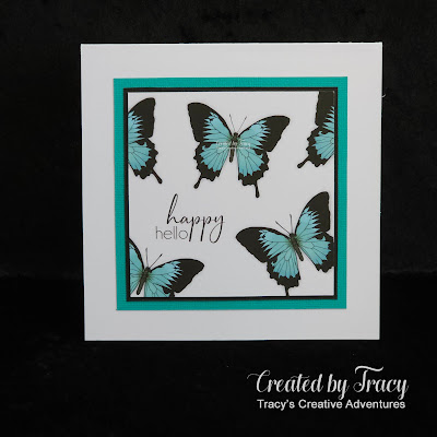
My 5 1/2" square card uses the delightful new Butterfly House 
digital stamp set from the Beccy's Place Store.  
I took the Ulysses pre-coloured digital stamp image panel I created earlier, flipped it horizontally, then added the same happy hello sentiment.  THEN I took it up a level and tried my hand using the technique Beccy shared HERE and used Copic C0 and C1 Cool Grey markers to add shadows around each butterfly, giving the illusion of dimension.


The shading is subtle, it might be easier to see the shadows
by clicking on the photo to view it in full screen.
I might have to take a brave pill and try this again with darker markers.


  I trimmed the image panel, matted with a 1/16" black panel, matted with a 3/16" Mermaid panel (much darker than the Capri used on the first card, both colours work perfectly with the colours in the butterfly wings) then added the panel to a 5 1/2" square top folding card base made from the same smooth white cardstock.


~~~*~~~*~~~

I have made two cards same-but-different using this Ulysses Butterfly image.
Here they are, side by side, 2nd card on the left, 1st card on the right.
You can read all about my first card HERE.


~~~*~~~*~~~
INGREDIENTS
Butterfly House digital set from the Beccy's Place store
Ulysses pre-coloured digital stamp
happy hello - digital sentiment - from the same set
Copic Markers - Cool Grey C0-C1 - to add shading for dimension
textured cardstock - American Crafts - white & black
textured cardstock - Kaisercraft - Mermaid
300gsm smooth white cardstock - for card base
scoreboard & bone folder - to make card base
sharp craft knife + self healing cutting mat + steel ruler
- for cutting image panel and matting layers
Perfect Layers Rulers - for matting layers
Helmar 450 Quick Dry -
liquid adhesive - to adhere the layers

~~~*~~~*~~~
I have entered my card in the following challenges:

1 comment:

  1. Adding the shadow definitely gives the illusion of dimension Tracy, they look fantastic! I love that you've merged the sentiments onto the image panel too.
    Cheers,
    Beccy

    ReplyDelete

Thank you, I appreciate that you have taken the time visit my blog and to leave a comment.

In line with new Data Protection legislation (GDPR) of May 2018, those leaving a comment on this blog do so in the knowledge that their name, link to their profile or blog, as well as comments they leave are visible and accessible to all those who visit this blog and thereby consent to the use of that personal information for that specific purpose.
Followers of this blog should be aware that their photo and link back to their profile are visible and accessible to anyone who visits this blog and thereby consent to the use of personal information for that specific purpose. This Data Protection and Privacy Policy applies to all content published on my blog and to content published on my blog prior to this document becoming effective.
By visiting this blog and commenting, please consider yourself informed of this privacy and data protection notice.